Client Name: Entrepreneur Magazine
Industry: Press/Media
Location: Irvine, California, US
Size: 51-200 employees
Company Bio:
Entrepreneur Magazine is a magazine and website in America that publishes news stories about small businesses, entrepreneurship, money, and success. The magazine was originally published in 1977 and has grown to become one of the top 500 franchises in America. Entrepreneur Magazine publishes 10 issues every year and has its headquarters in Irvine, California. The magazine is available in over 151 countries and in multiple languages. Multiple spin-offs of the magazine started in the late 1990s to help educate the younger generation have a guide to becoming successful.
“If you consider yourself an entrepreneur this is the magazine for you. It’s full of inspiring stories that get you up off your couch and working on your ideas. It’s awesome to hear about other entrepreneurs who are doing what you want to do. Even if you are just an entrepreneur at heart this will be awesome content.”
– Tyler Collins
Entrepreneur Magazine Customer
Overview of the project:
For this project I had to create a magazine cover for a real-world magazine brand. The cover is to contain an illustration using Cinema4D to create the geometry, textures, lighting, and other visual elements to help make the cover illustrations look more realistic. The magazine cover must be 16×20 inches, 150 PPI, and be a final JPG file for submission.
How has the project helped the client? Has there been an increase in traffic, and other performance metrics- Use stats/ numbers?
The magazine cover has helped increase the brand’s recognition over 15%, especially with the female audience. The magazine is also available online which helps increase the amount of SEO and visibility online.
The Challenge:
The magazine cover concept idea that I produced for Entrepreneur Magazine regarding the topic of women in the workplace and working at home. Entrepreneur Magazine wants to see an increase in their female audience, consumers, and readers. The client wants this project to give the immediate affordance that the publication is filled with the best stories relating to entrepreneurship, money management, and small business. As the magazine always focuses on entrepreneurship for both male and female, they wanted to dedicate one issue out of the year to help raise awareness to some of the milestones and steps that are involved when you are a female trying to start your own business or company.
The primary objective was to create a magazine cover that gave the immediate affordance that women entrepreneurs are becoming increasingly popular in the current media and press industry. Additionally, this project is to be created and produced in conjunction with the Concept Design class. The magazine branding must reflect a real-world company with a usable, and understandable value proposition.
The secondary objective was to use Cinema4D to create the 3D illustration for the cover, Adobe Illustration, Photoshop, or InDesign to create the layout and finalize JPG version of the cover. The Cinema4D illustration is to be made using your own geometry, textures, lighting, and concept design. Also, the materials should all be created and produced by the designer using specific layout dimensions and typography. The final version of the cover is to be 150 pixels per inch (ppi) with a size of 16×20 inches.
The Approach:
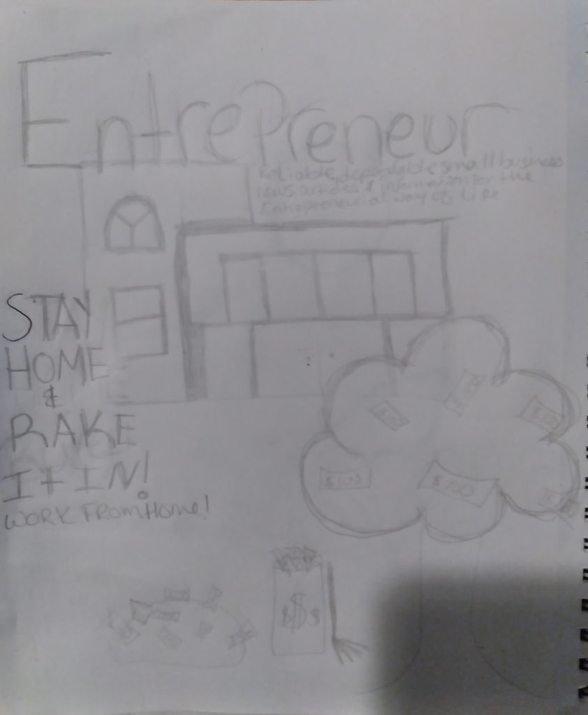
To create this project, I started by choosing a few generalized magazine brands that made an impression on my everyday life. Upon narrowing down my ideal magazine branding, I concluded that Entrepreneur magazine fit my project requirements and would be an ideal choice to create my composition. The next step was to come up with some concept ideas for the illustration on the cover. The illustration is a 3D composition that should be a collaboration of ideas that come together to support the magazine’s target audience and overall ideas. The client wanted a way to entice female readers to purchase an annual subscription to their magazine or buy monthly copies of their issues. Once I finalized my 3D concept idea for the cover, I created a rough sketch of the illustration and elements to be created in Cinema4D. Next, I sketched out the wireframe and placements of the text on the cover of the magazine. After my sketches were complete, I did some research on the magazine’s target audience and past issues. This helped me get an overall united feeling for the magazine.
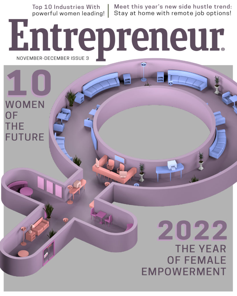
For my Cinema4D illustration idea to go on the cover of the magazine, I choose to do the symbol for females, ♀, as a floor plan in an office building. This gave the reader the affordance that you can work from anywhere, whether it is at home or in the office at your work. Being an entrepreneur means being a person who organizes and operates a business and takes on greater than normal responsibilities to increase the opportunities to be successful. Additionally, I wanted to include some furniture to help increase the recognition of the building being an office space, so I added a few printers, televisions, computers, and desk lamps to the scene.
For the magazine cover, I knew I wanted to follow the format that Entrepreneur Magazine currently uses. The magazine follows a rough structure with a white rectangle and a color box underneath it to highlight the articles and stories in the current issue. I knew I wanted to highlight the female stories and bring the immediate affordance to the readers upon a few glances at the cover. I used the primary stories from the issue as the main headings on the cover, and then used the smaller articles as a teaser heading at the top of the cover, above the logo. Once the wireframe and layout were finalized, I created a color scheme that would help attract females to the new issue and match the 3D illustration I created. Lastly, I had to make sure to export the final AI illustration as a JPG file with the proper pixels per inch and resolution requirements.


The Solution:
The strategy and solution that I used to help solve the problem that Entrepreneur magazine was to keep the overall style and feeling that the current magazine uses on its cover. This styling consisted of a few headlines of the stories in the current issue, and a relaxed color scheme. The Cinema4D illustration required learning how to use the Cinema4D software correctly to create primitives and splines. Additionally, I used certain deformers from the application like the Bend and Taper tools. This helped make creating some of the furniture like curved sofas, tables, and chairs easier and more realistic. I was able to use the things I learned this quarter about the Cinema4D software to help make modeling and creating non-organic shapes easier, as the software only gives you basic shapes like cube, spheres, triangles, etc. Once I had my 3D rendering of the element finalized, it was time to begin putting the magazine cover together. I had to import the rendering for my female floor plan into Photoshop and then use the alpha channels to mask out the background of the building. I used the anti-aliasing effect in the export panel to help soften the lines around the edges of the rendering. Once I finished masking out the floor plan, I imported the file into Adobe Illustrator and proceeded to begin making the layout of cover. This included having the placement of the Entrepreneur logo in the top area of the cover with brief call to actions on the lesser important stories, which would be considered H3s in an online blog. Below the Entrepreneur magazine logo, I choose to have a small white border around the main visual element on the cover. Additionally, the background will be a grey color to help attract the viewer’s eye to the main element on the page. In this case, it was about women in the workplace and the impact that have in making things successful. I choose to place the hierarchy of all images in an unusual way, although they are placed out of order, I am using the font sizes to show the level of importance for each story. The hierarchy begins with the brand logo, Entrepreneur Magazine, being the top level of importance or an H1 in a blog post online, next the most important stories would be seen next as they would be considered H2s in a blog post. These headings will be found in the grey area below the logo. The last level of importance for the cover stories and articles are found at the top of the cover page with a brief highlight of what keywords stick out the most for our readers. Once I had all my visual elements designed in the correct order, I was able to finish the overall image composition and export out the final JPG rendering of the magazine cover.

